Firstly thanks to all those who are taking part in this collaborative project.
Back in the day wood and metal type revolutionised the creative industries. With the introduction of new technology many type houses now face extinction. Today it is easy for anyone to manipulate typefaces and design layouts. However, with this new found freedom is there a danger that we lose the knowledge and craft of typographers and designers that worked in the era of the printing press?
‘Almost Extinct’ is a project that seeks to rediscover this ‘craft’. The idea is to source leading experts in this field to help design and print an alphabet of animals without the use of a computer. Some of the designs require many passes of the printing press with letters at various angles. Others require overprinting with a precise weight of ink. All of them require the sourcing of the perfect wood or metal letters, that should ideally suit the scale of the animal.
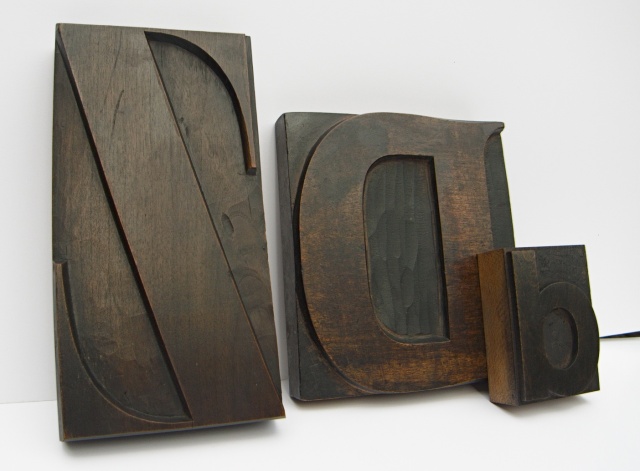
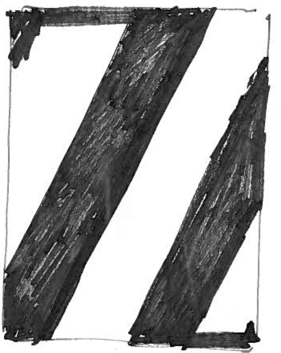
Dave Wakefield, a typographer I worked with when I first came to London, is aptly the first person to take part in this project. He lives in Sussex where he has garages full of wood and metal type that he has collected since 1970. He chose to execute ‘D’ is for ‘Duck’ and ‘Z’ is for ‘Zebra’.
Dave had this to say about his work and the project:
“The duck and the zebra. Hardly the homogenous pair to walk the board into this ark of a project beautifully conceived by Tony Davidson and Kim Papworth. It’s nothing new. But equally it’s everything new. A new approach in its simplistic representation, that draws you in, makes the point, and leaves you in no doubt of the result. They enter left of field, figurative or abstract in their manifestations, nothing vapid or ill-conceived line up to the challenge.

The 'Z' is from a French fount, c1900. The 'D' is an English 'Latin' face from around 1880. The Lowercase 'd' is from a more recent fount of 'Neue-Haas Grotesk' - English cutting of Helvetica made in the late 60s
The medium and use of wood and metal type is unique in that it offers another dimension or secondary layer to the physical form. That of texture. It’s the intelligent use of this texture that will add greater potency to the solution. Just the two forms of D create the unmistakable image. Careful overprinting leaves the lowercase form shy of solid on the crossover, and at the same time feathery soft. A result of the underlaying and overlaying technique known as ‘make-ready’. A 30-line Bold Latin capital was chosen for its heavy, bulbous, outward-curving form, and unique serifs that would pronounce the tail feathers and fill the counter to make the eye. Counterpoint, in the choice of a Neue-Haas Grotesk lowercase letter pit against the nineteenth-century Latin to strengthen the modernity and essential property to educate.
The abstract solution in Z conveys an image formed from just one letter, a 36-line French Classiques Allongee, transversing the press bed, one overprint at a time. Once again careful make-ready strengthened the serifs just enough to identify, leaving a coat in the texture and fissures of the material. The queue of twenty-four remaining letters should earn their place on board this project“.
This attention to detail is what I love about the craft of these pieces. The sourcing of precisely the right letter and the weight of printing are as important as the finished design. It is crucial that everyone who takes part in this project records their journey, as it’s an important part of the concept. Some of you will have access to your own personal wood or metal type collection. Others may choose to visit type houses that are still in business or source them on Ebay. If you have access to facilities be sure to let us know.
Once we have all the animals the plan is to hold an exhibition of prints with the sourced letters that were used next to them. Profits from this or any other merchandising will go to helping endangered animals, that like wood and metal type have come close to extinction. I recently met a contact from the WWF which celebrates its 50th anniversary in 2011. I shared Dave’s ‘D is for Duck’ with him and he asked if we could create 50 animals. I think this is possible and something we should aim for.
Kim and I have drawn designs for each letter of the alphabet. Some letters have more than one animal design. We feel strongly that the secret is to keep the designs as simple as possible. We’ve seen many other examples of animals made out of type that are way too complicated. Simplicity is key. With each animal we have tried to keep the palette of letters to a minimum in order to maintain a graphic simplicity.
We are totally up for looking at any other designs should you want to have a go. There is a list of animals names here, but we warn you there aren’t many animals that begin with the letter ‘X’.
So take a look and let us and Ellie, who is helping me organise this project, know which ones you would like to have a crack at. Or if you have any further questions contact us at ellie.price@wk.com.
Thanks for taking part.
Tony


What a great project! So far my favorite is the Duck. Can’t wait to see more jx
Maybe the duck could be printed in colours on a child’s duvet, which was originally likened, and perhaps formerly known in this country, as an ‘eider-down’ ?
the duck is cracked my friend. what we need now is other letters of the alphabet cracked to the same high standard. bet you’ve got some perfect letters stored away in that barn of yours!
Thx . Lucy Brown just offered to have a go at Llama and Butterfly. Spread the love.
Pingback: ZEBRA PRINT « STILL LIFE
What a wonderful project, right up my street!
I’ll trawl through the archives and see if I can help with any letters, got a few boxes of odd sorts that are waiting to be put to good use.
I would love to take part too and will be in touch
Jacqui
any letters turned up?
Pingback: Things We Like: Almost Extinct | BaseNow
Hi Tony. Not sure if it’s up to scratch but I thought I’d have a stab at N. Can I email you with my scribbles?